
Otelo is a German mobile service brand owned by Vodafone DE, specialising in fair-priced tariffs with great network coverage, and holding a similar market position to UK’s Giffgaff.
Otelo had gone from a startup to being acquired by the European telecoms giant. Its success had led to its website growing organically and its ecommernce performance was felt to be suffering as a result of this lack of structure. Otelo asked London-based marketing consultancy firm Stream20 to help develop a new online strategy. Having no UX specialists in-house, Stream20 hired me to deliver a complete UX proposal to help the client to visualise how an upgraded website could better represent their changing business and help them keep their edge in a competitive market.
My role
Stakeholder interviews
I travelled to Vodafone DE headquarters in Düsseldorf for three days, meeting with the executive team and senior representatives from marketing, operations and customer services, in order to fully understand the business and its challenges.
Expert review
I conducted an audit of the existing website, focusing on the purchase journey; but having met with key stakeholders, the user account area was identified as problematic, so I extended the review to include this key customer touchpoint. I defined the business and customer objectives for each page, and used these to identify opportunities for improvement through improved content, design and functionality.
Key recommendations
- Value proposition – Otelo’s USP was sometimes lost where the customer was overloaded with different messages, or missing entirely at key customer decision points. Landing pages needed particular attention to content and layout to communicate the brand values.
- Navigation – A website’s main navigation’s role is not just to enable browsing, done right it can communicate the product structure at a glance. I recommended the Otelo’s navigation be streamlined to reflect the customer’s mental model and priorities, including separating tariffs and handsets, and moving corporate information to the footer.
- Calls to action – The website needed to help the customer complete their task by ensuring that each page or step has a single primary action.
- Responsive design – With Otelo.de’s design having been unchanged for some time, its mobile experience had not kept pace with the wider internet; key information was hidden below the fold and interactive features not optimised for the small screen. A slick, mobile-first approach was needed to meet customers’ high expectations of a mobile service provider.
- Explaining the product range – Choosing a mobile tariff can be bewildering. I recommended Otelo introduce an interactive tool to help customers compare tariffs and handsets to find the right deal for them.
Proposal
I produced a complete set of wireframes to demonstrate how website improvements could better meet both customer needs and business objectives, addressing the key findings of the expert review and stakeholder interviews.
Below are example screens from the deliverables, with corresponding screengrabs of Otelo’s previous web for comparison.
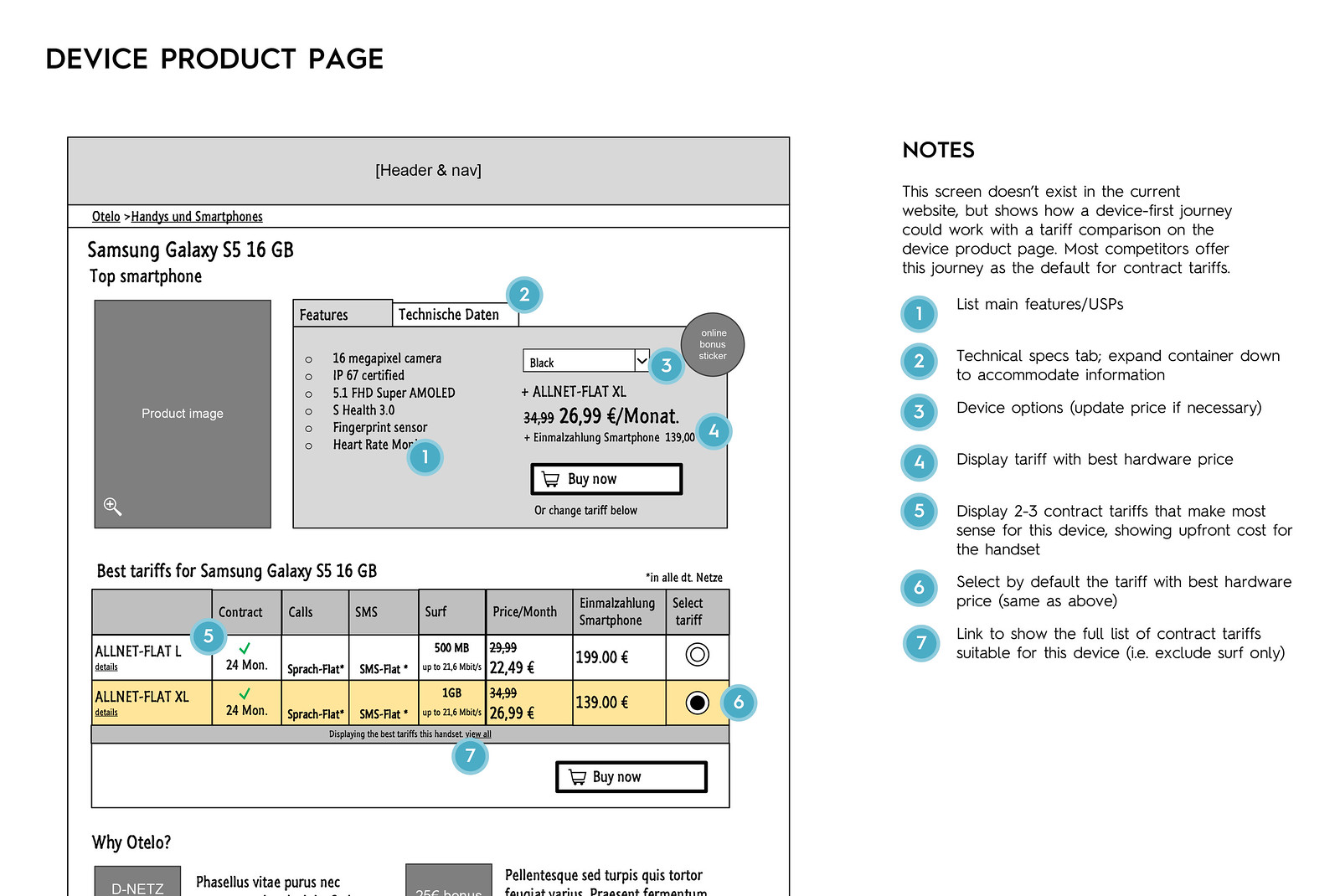
Handset product page wireframe
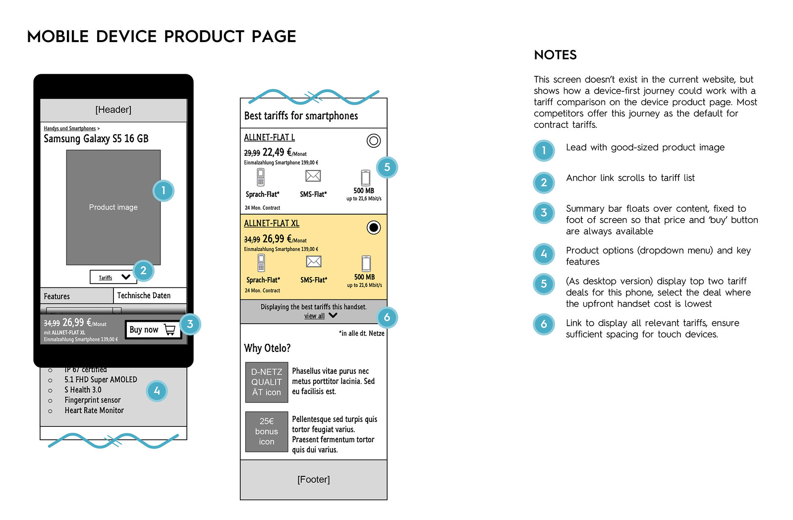
Handset product page wireframe (mobile view)
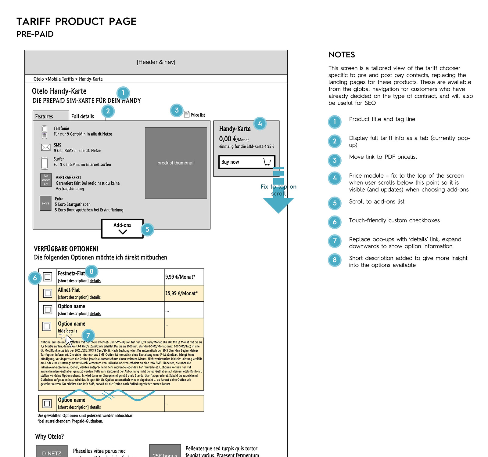
Tariff product page wireframe
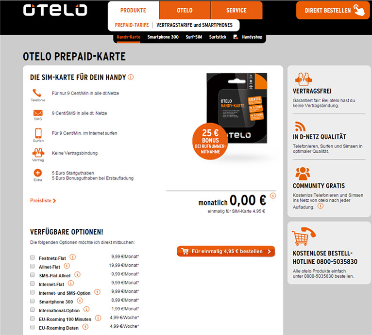
Previous tariff product page from Otelo.de
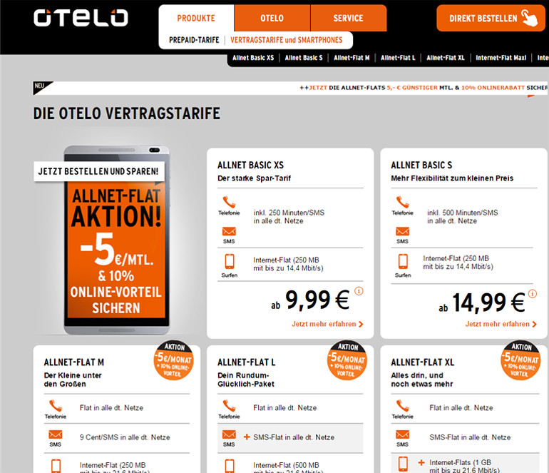
Previous post-paid tariffs landing page from Otelo.de

Wireframe for tariff chooser (replacing tariffs landing page) with quick filtering and clear side-by-side comparisons

My Otelo (user account area) with new, card-based interface to easily accommodate different customer account types and responsive layout