The best way to improve any online process is to start by understanding user behaviour. For Tate Online Shop I set up analytics to gain user insights in order to identify ways to increase the revenue. The checkout process had been built around systems rather than users and analytics data highlighted numerous opportunities for improvement. I worked with the Online Shop Manager to create a streamlined, checkout that put the user in control, and resulted in dramatically increased conversion rates.
The goal funnel analysis showed that there was high goal amandonment within the checkout process, resulting in loss of potential revenue. The main drop-off screens were login/registration, delivery address, delivery cost and payment. By tackling these failing screens, cutting the user journey from 7 to 4 stages and introducing a clear layout, checkout abandomnet was dramatically reduced.
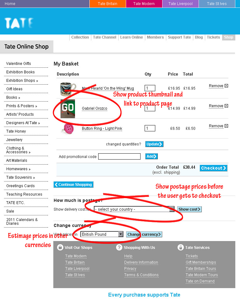
Basket with product thumbnails, links to products, postage preview and currency conversion

Stage 1: Login/register, a simple split
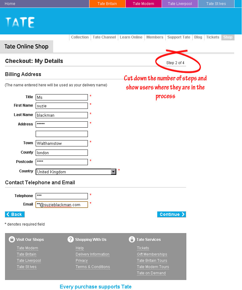
Stage 2: My Details, entry fields for billing address and contact information

Stage 3: Delivery, entry fields for delivery address and choice of delivery method
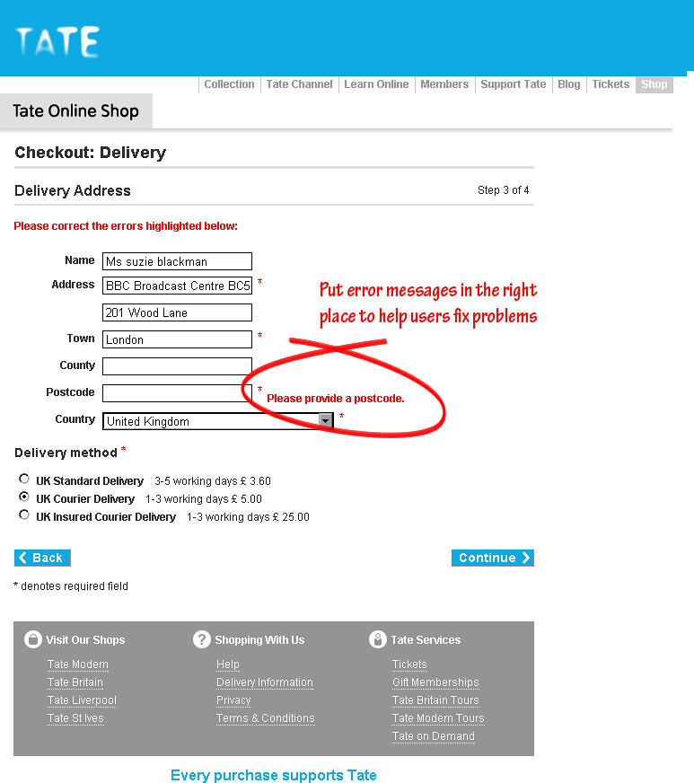
Stage 3: Delivery, showing inline error messages

Stage 4: Place order, the user can review all order details before they commit
The worst performing stage of the old checkout process was the final stage, the payment screen. Users were hesitant to input their credit card details with no opportunity to review the order and no indication would happen next. For the new payment screen, I added a summary of basket contents, delivery/billing address, reassuring the user their order was correct as they enter their credit card details. I also gave the user the option to correct any mistakes from here.
The existing login/registration screen layout was confusing. I re-designed it with a simple horizontal split between entry and CTAs for new and existing users. Previously new users were forced to register before entering the checkout process, now new user’s information is collected as they go.