I’ve clicked ‘unsubscribe’ from a mailing list…
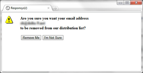
‘I’m Not Sure’? Kind of amusing. I am quite sure, thanks – if I wasn’t I could just click back or close the window – but I’ll click you anyway to see if you’re going to sell it to me (don’t know why you couldn’t have done it on this screen, but hey, I’m feeling generous).
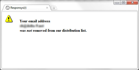
Is that it? Now I’m sure.
Email lists offer so many opportunities to engage with the user and start a journey on the sender’s website – even an unsubscribe could lead to a purchase. However, 99% of the time users are forced into a dead end and a UI that’s unintuitive and just plain weird, damaging the brand for a user that’s already turned off.
This example is from a big, high-street brand and I was amazed. It’s a rare flashback to the Internet of 1996 🙂
Also a good example of where a decent <title> would help things.