Re-posted from an article I wrote for 100 Shapes
The finer points of conveying the finer points
When I was starting out as a digital designer, I found little or no guidance about how to create and use wireframes. If could pass any knowledge onto my younger self, this would be it.
Wireframes are an invaluable part of the interaction design and user-experience toolkit. They’re useful for everything from explaining a rough concept to exact specifications for the interface build. But…I think that there’s too much emphasis on wireframes as a deliverable when actually the concept is the deliverable. Wireframes are purely the means of communicating the concept, so let’s focus on making them effective for communication.
Why are wireframes useful?
They encourage realistic thinking
Everyone with a solution in their head thinks that it’s is the right one, but is it? Crystallising ideas into wireframe form helps you (and others) judge whether it could actually work in practice, without having to build anything.
Wireframes also allow us to work with scale accuracy, which is especially important for mobile design. Can you really fit all of those buttons in that toolbar?
They cut the distractions
There is such a thing as showing something too realistic. When presented with a hi-fi visual mock-up, many people find it hard to believe that it’s not real, and focus on irrelevant details instead of the big idea you’re presenting. If you’re getting more feedback about the sample copy and imagery than the design concept, it doesn’t necessarily mean everyone’s happy with the concept, it could mean that they can’t see past the content.
Wireframes allow us to display only what’s relevant, and communicate it better.
They make it professional
A sketch might not be enough to convince busy stakeholders that the idea is right (and besides, mine aren’t neat enough!). Working up a wireframe demonstrates that it’s had enough thought to be worthy for consideration…and in the process of wireframing it, you’ll have already encountered many of the questions you’ll be asked when you show it to a wider audience.
Are wireframes the right tool?
Not always. Reaching for the drawing software too early in the design process can affect the quality of solutions. Wireframes encourage analytical thinking, which stifles creative flow. Use sketches to capture the essence of your ideas then work them up and evaluate them later.
It’s a tough crowd
Some people just find it impossible to visualise a product from a wireframe diagram. It’s not their fault! When this happens, find other ways to communicate. It might be time for a hi-fi visual, but you could also try making something physical to emulate the experience, for example presenting the wireframes on a cardboard phone.
What’s the best software?
There are a variety of different tools that can be used to create wireframes; from multi-functional drawing packages, like Adobe Illustrator, OmniGraffle and MS Visio, to purpose-made wireframing software such as Axure and Balsamiq, which offer prototype generation and cloud-based collaborative working respectively.
Which package you choose is entirely a matter of personal taste. Try them out, use whatever suits your workflow and don’t be bullied into thinking there’s a right or wrong tool.
Personally, I like Visio – it’s a very powerful drawing package with handy features like style themes. The interface is complex, but once customised it allows me to work faster than I could using any other software.
Invest the time in making libraries of useful stencils, creating templates and customising your interface for the task in hand. This will enable you to focus on the ideas, not drawing the boxes.
What should wireframes look like?
There is no standard style for wireframes. As with everything else in UX, you need to understand your audience. Choose an appropriate style for the context of use.
Using colour and decoration to add some branding will help those who find it hard to visualise the final product. Using a sketched style will encourage others to be forgiving about an idea that you haven’t fully resolved yet, but could make build specification documentation appear slapdash.
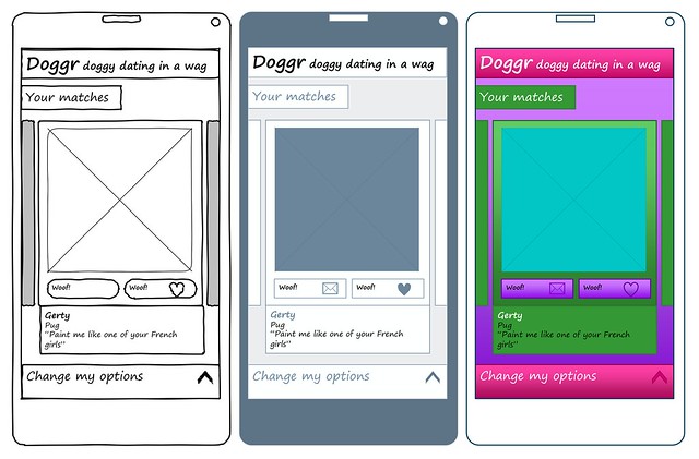
Sketch, simple diagram and branded themes applied to the same wireframe
What’s with that funny font?
Until a couple of years ago I always used brand fonts in wireframes. But then I hit a problem; a project stakeholder was mistaking my visually accurate wireframes for finished mocks. As soon as I changed to a handwriting font, the problem disappeared. The handwriting font provides a distinction between interaction design and visual design deliverables that non-designers can easily recognise.
Beyond diagrams
Annotations are useful to explain the finer points of the design that might be missed by anyone looking at it cold: How should a list of items be ordered? What happens when a button is clicked? Where does that content come from?
There are two ways you can do this; numbered references to points in the diagrams, or inline notes. I prefer the latter because the reader doesn’t need to do any cross-referencing to understand the diagram. It doesn’t look as pretty, but as hope you’ve gathered, that’s not the primary concern.
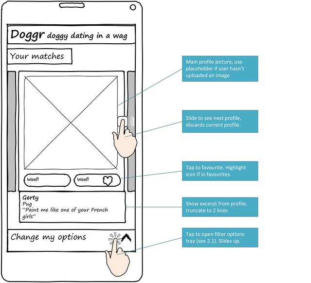
Inline annotation
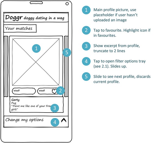
Numbered reference annotation
Other tips for excellent wireframes (that your colleagues will thank you for)
- Add page numbers – print-outs get in a mess
- Put your name and the modification date on each page
- Don’t use huge sheets and tiny text – they’ll be printed on A4
- Talk them through it – people appreciate the opportunity to ask questions