Now I’ve switched to Android, I’m amazed at how much I dislike the iPhone I once loved.
My switch was motivated by the lure of the tasty hardware of the Samsung Galaxy S II and a desire to rid my life of iTunes.
I’m VERY happy I made the swap, but not for the reasons I thought. The points of frustration I now have with the iPhone are less about it’s relative sluggishness (the Galaxy S II is very snappy), and more about UI. Hard to believe I know.
Not everything is dreamy in Android land (an “Android UX Fail” post may follow soon), but it’s a nicer place to be that iOS 4 at least.
1. Set up
Getting my calendar to sync with my iPhone was a huge headache. Not half as much of a headache as syncing my contacts however – in the 2 years I had the iPhone I never managed to get it working properly and wiped my cloud contacts a couple of times along the way.
With Android, I logged in once with my Google account and my mail, calendars, contacts & talk all just worked. Result.
2. Back button
This is the number one thing I miss when I pick up an iPhone, where the back button is in an inconvenient location and it takes up screen real estate. It’s nicely under my thumb on my Android phone, ergonomic and tidy, and it makes Android nicer to design for.
3. Menu button
Extra functions and settings can be hidden under the menu button leaving more space for content, again, leading to a cleaner, more predictable UI.

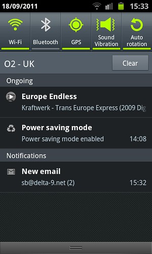
The Android notifications bar pulls down to reveal key toggle settings and the full list of notifications.
4. Alerts
Google really got alerts right with the notifications bar. You don’t have to unlock the screen to see alerts, and they don’t disappear before you’re done with them, unlike iOS’s push notifications. My iPhone feels dead when I pick it up now, the Android feels like it’s been busy doing useful things for me.
Well done to Apple for recognising they screwed up here and giving notifications an overhaul in iOS 5, I look forward to seeing it in action.
5. Droid Sans
SUCH a nice font, and more compact than Helvetica and renders very well at small sizes.
6. OS updates over the air
No iTunes! iOS 5 has fixed this too, thank goodness.
7. Key settings in notifications bar
Having shortcuts to commonly used settings available at all times, without leaving the current task, is fantastic. In iOS even frequently used settings are buried deep within the Settings app, leaving the user dependent on alerts for shortcuts into WiFi set-up etc.
8. True multitasking
I think Apple shot themselves in the foot with this one. Allowing apps to do things while the phone is idle makes for a more useful device.