Today is my last day of having my arm in plaster. I wish I could say it had been a positive experience but, other than increasing my knowledge of world cinema, it’s been rubbish. Discomfort aside, not being able to tie my own shoe laces or cut my own nails, let alone do any of the things I love, has been incredibly frustrating. I now have a glimpse into what it’s like to live with a physical disability and I have a few observations about different people’s attitudes.
My limited abilities have met with three different reactions:
The over-zealous
People who either see me struggling and do it or try to preempt my needs by doing things they think I want.
This has manifested itself in a stranger snatching an envelope out of my hands in order to post it for me (which was weird) to a certain family member dismantling my extractor fan unprompted but left me with washing-up I couldn’t do (which was extremely annoying).
This type of person thinks that they’re helping but they’re not. It takes away control for me to do things myself, the way I want. It’s also disempowering, preventing me doing things which I’m actually able.
The helpful
People who ask whether I want help, and what exactly and how I want it done.
The most useful thing anyone did for me was to chop me a load of onions, garlic and ginger so I could cook proper meals for myself.
The indifferent
People who either don’t notice or don’t care that I need help, or even get angry that my being less-able inconveniences them.
Examples: People tutting at me at the supermarket checkout because I took a bit longer to pack my shopping; Everyone who didn’t offer me their seat when I was on the way to hospital despite me looking like road-kill.
It goes without saying that the middle category is the best way to behave but it comes naturally to surprisingly few people. It requires empathy and to regard a person who is less able as an equal, which is difficult.
Hopefully you have realised why I’m writing about this here and the parallel I’m trying to draw. Designing interfaces that cater for users with differing abilities, without patronising, making them feel stupid, or taking away control is something we all talk about but I’m not sure we achieve it very often.
Accessibility is an extension of the challenge, but it is in many ways easier to cater for because disabilities are specific and there are tools that mediate. Facilitating a task to a user with no experience and limited understanding of it, while allowing an experienced user to perform the same task quickly is a tricky thing.
Some applications choose to do this in a single interface while others create separate flows for different types of users.
The good
- The Guardian iPhone app – unobtrusive tooltips point out features that might be hard to discover. Once dismissed by the user, they never appear again.
The bad
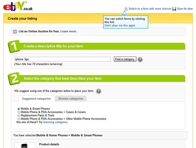
- eBay’s seller interface has two separate flows; ‘Quick sell’ and ‘Advanced sell’. ‘Quick sell’ looks nice, is scannable and compact but omits many options that a new seller might really like to know about. ‘Advanced sell’ is a sprawling mass of forms with no visual hierarchy, making it easy to make mistakes and hard to find the checkbox you want. The user shouldn’t have to sacrifice a good experience to get the control they want, this is fixable.
The ugly
- “It looks like your writing a letter…” – the MS Office paper-clip that tells you things you already know. But hey, if you don’t like the paper-clip you can have a puppy instead.
