The interface I’m currently working on has a component that’s quite tall. Screen sizes for desktop/laptop are becoming less, rather than more standard, diverging at both ends of the scale, and in aspect ratio and even orientation. The issue is only getting worse, and small screens are established on both the low end and premium markets. Anecdotally we know that our interface is difficult to use on a laptop but there have been no customer complaints and conversion rates seemed good.
As UX practitioners, we’re great at spotting the problems with an interface, and we try to stay close to our users so we have have an insight into what’s important, but it can be hard to prioritise without quantitive data. Business priorities get skewed by a stakeholder opinion, an angry piece of customer feedback or a vocal user-testing participant.
We can also find ourselves and our own experiences being out of touch with users; while we’re comfortably browsing on huge screens and multiple screens, our users are struggling along on netbooks.
My main home machine is a 13.5″ laptop, I also have a 12″ laptop and I tried out the interface for myself. I was still able to complete the task but it was annoying. I felt it was was an issue for our customers, but needed to know for sure in order to prioritise it over other issues.
Many designers get scared-off by analytics, which is a shame because it so useful in understanding users (and proving a point – which we all love). For me, i’s nice to be back in an e-commerce environment where we’ve got the tools to know exactly how well we’re meeting our goals.
I used Google Analytics to answer the following questions in relation to screen size:
Is there a problem?
Is it really affecting users? They are typically willing to put up with a lot. Is it annoying enough to make them abandon the task? You can’t answer this unless you know what the goal is and can measure it, and you’ve got to be able to segment users based on the metric(s) causing the issue. In my case, the metrics were conversion rate vs screen height.
What is the impact?
How many users is it affecting? It might be a show stopper for 0.25% of your users or a user-base outside your target, but who cares.
Extracting the data
Google Analytics doesn’t allow segmentation based on screen size (not sure why), nor does it let you break down screen size height and width components. I was not able to get what I needed in one report.
Given the prevalence of non-standard screen heights in our stats, it seemed wise not to extract specific sizes, rather look at ranges at 100px internals, starting at 600px. Below 600px I would have got mobile phones in landscape mode which would have thrown the numbers.
I used regular expressions to extract the height ranges from the Screen Resolutions report (Vistiors > Browser Capabilities), then noted down the % of visit and % of conversions for each.
For example, to select all visit from users with screen height 800-899px, filter containing:
x8..$
And screen heights of 1300 px or larger (within reason):
x1[3-9]..
I plugged the numbers into a quick Excel graph.
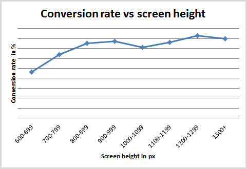
I haven’t shared the numbers on the Y axis, but it does start from zero. You can see a clear drop-off in conversion rates for the screen heights below 800px, with those below 700px taking the biggest hit 40% below.
Thinking about the second question, I looked at visits in the 600-699 and 700-799 groups, they made up 3% and 21% of visits respectively. So, despite the dramatic drop in conversions from the 600-699 group, there would be little benefit in optimising for that specifically, compared with the 700-799 group (and fixing it for them improve the experience for smaller screens).
Thoughts on data accuracy…
- There was a large chunk of visitors with screen size ‘undefined’. My data assumes their screen size distribution was the same as the ones that were recorded. If they were all using a particular device or OS my figures could be skewed.
- The current interface doesn’t support tablet devices. They are only a small part of the user-base, but I should really have excluded them because they have a conversion rate of zero.
- A user’s choice of screen is linked to other demographics, e.g. wealth and profession, which also affect the likelihood of conversion.
Really interesting. I think the assumption is users will put up with less optimum experience as long as the page displays quickly. For example where I work we are only now working on a mobile interface for our site, pretty late!
Yeah totally, I think people are used to a sub-optimal experience on mobile, and they’ll work harder to get what they want.